How to choose colors for your web design
Color. It’s everywhere.
Colors influence our visitors where to look, what to click, and how they interpret elements on a website.
it’s important to understand how to choose colors for your web design, how to harness their power.
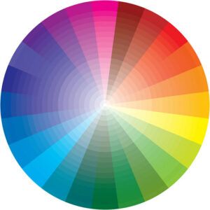
Color wheel
We separate colors in a color wheel into three major groups: primary, secondary and tertiary.
The three primary colors are red, blue and yellow. These colors are the base colors that make up all the other colors on the color wheel.
Mix the primary colors together, and you get the secondary colors. These are orange, green and purple.
Tertiary colors comprise the middle colors like yellow-green and blue-green. They are created by mixing a primary color and a secondary color.
Colors and feelings
Warm colors represent warmth like red, yellow and orange.
The color red can increase a person’s heart rate and cause them to breathe faster. Red is associated with lust, excitement, love, energy, and movement. It also has some potentially negative associations including war, violence, fire, anger, and danger.
Cool colors make people think of chilly colors like blue, green and purple. Cool colors tend to have a calming effect.
Purple associates with royalty. It can communicate creativity, imagination, authority, sophistication, power, wealth, prosperity, mystery, wisdom, and respect.
Brown is a warm, natural color associated with earth, ruggedness, reliability, stability, friendship, and nature.
Black is a powerful color often associated with sophistication, elegance, authority, power, sleekness, stability, strength, formality, and intelligence. It can also symbolize death, mystery, evil, and rebellion.
We associate White with purity, cleanliness, virtue, happiness, sincerity, and safety.
Background and text colors
The best colors for slides have high contrast because we easily see them.
Dark backgrounds should have a light text with bright accent colors.
Light backgrounds should have dark text and bold accent colors.
Doing it this way enables the audience to read the text and see the graphics or shapes on each slide.
Color clash
Red and Green clash and are difficult to read.
People who have color sight challenges will have trouble seeing your message.
Orange and Blue cause a disconcerting effect on readers as the colors can appear to vibrate against one another.
Red and Blue don’t have enough contrast to be seen well when used together.
Keep it simple
Are you spending way too much time on colors to achieve aesthetics and readability? This happens whether we are working on preparing PowerPoint presentations, brochures, logos, product labels and on our websites.
Keep websites simple when you are starting out so you focus your effort on the business and not get too distracted by the many details of putting a fancy website up.
All the best,

Luc
If you find this article informative, share it with your friends or/and leave a comment below.
About The Author
lucbizz
I’m Luc Dermul, a Belgian online entrepreneur living in “the big apple of Flanders” Antwerp
Terrific advice! Thank you!
Your welcome, Jan 🙂